WordPress website design and development for an industrial holding company
Brief
Admetos is an industrial holding and investment company, operating in Germany. The company has an impressive record of company acquisitions. The new web design had to be user friendly, modern, and fresh. It also needed to communicate Admetos’s values, differentiate the company from its competitors, and invoke the trust of potential partners.
The website had to be easily manageable and editable by the clients.
Key features
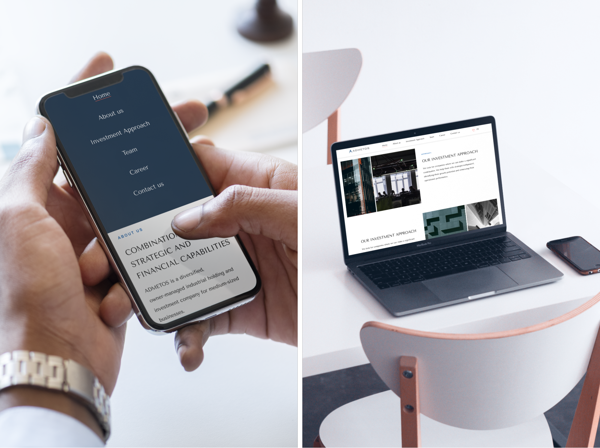
Modern-looking and unique design. Fully responsive.
Multiple languages.
Pop up windows built for company members description.
Automated posting of job offer.
Automated posting of new company members.
Process
To capture the project requirements and understand clients' expectations, we first had to organize the customer discovery workshop to understand why the customer needs web design and development services. We also had to understand the target audience segments and future marketing plans of the company.
As we are strong supporters of the Agile methodology, we decomposed the whole project into smaller stages from the beginning. The design process was split into a few steps, namely Prototyping and UI Design.
The result of each project stage was discussed with the client which significantly helped us save time and deliver a high-quality product.
Customer Discovery Workshop
During the first call Admetos communicated its main goals and vision:
- A modern-looking and professional website which invokes trust and respect of the current, and future partners
- Greater awareness of the Admetos mission, core values, and practices
- A CMS that can be easily maintained
- An elevated brand image that visually communicates the values of the founders “Excellence, Responsibility, and Growth”
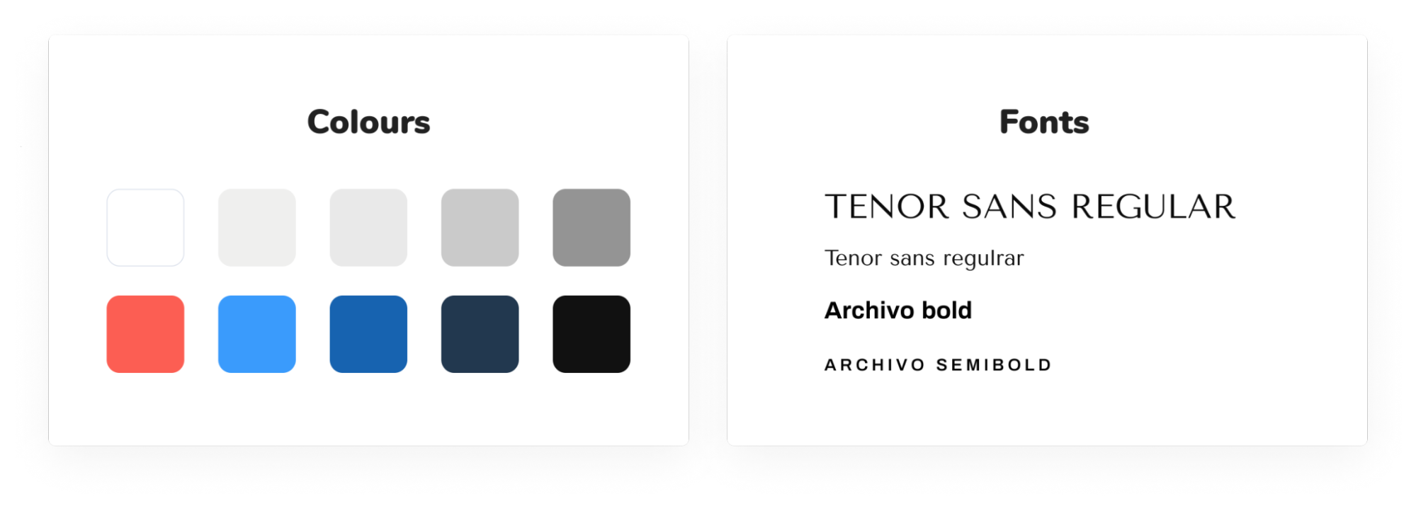
The company representative also conveyed their vision of the future website look, giving us a great sense of direction. The requirements could be summarized to the following: no bright colors, no depiction of humans or nature in the pictures, no excessive amounts of texts. The color scheme was pre-determined by the company’s corporate identity, icons, and bullet points had to be used to make reading easier, and break the text logically.
Mockup Design
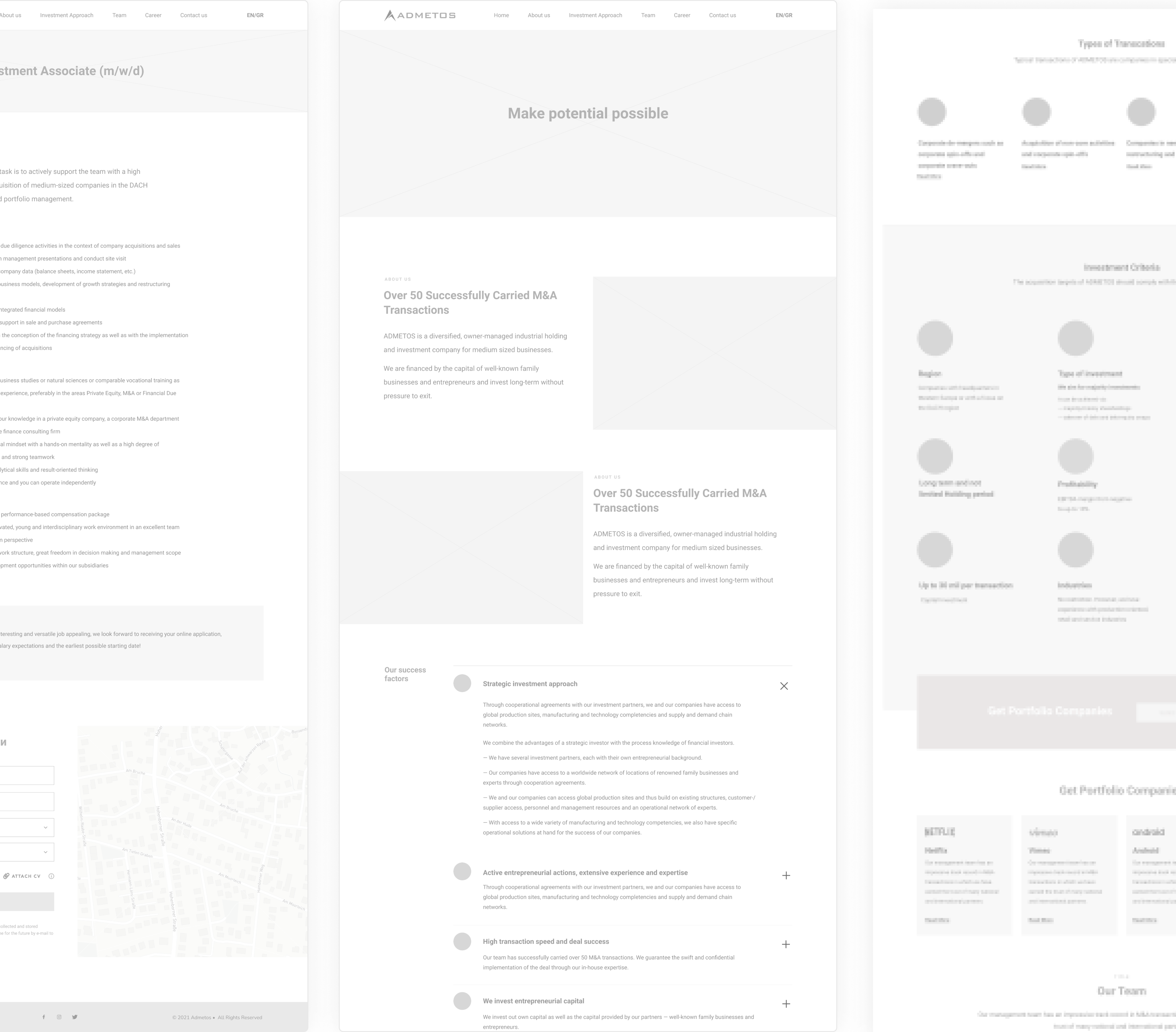
Low-fidelity mockups reflect the website structure, the positioning of elements, and the desired amount of texts. It is a great tool to check if you captured the project requirements well and correct all discrepancies before proceeding further. Over years, it has proven to be a necessary step to successful project execution.
For Admetos, we strictly followed the standard grid system to achieve consistency, convey a feeling of order, trust, and stability.
UI Design
To optimize the work and avoid many edits, we first designed certain elements of the page and applied approved styles to the rest of the design.
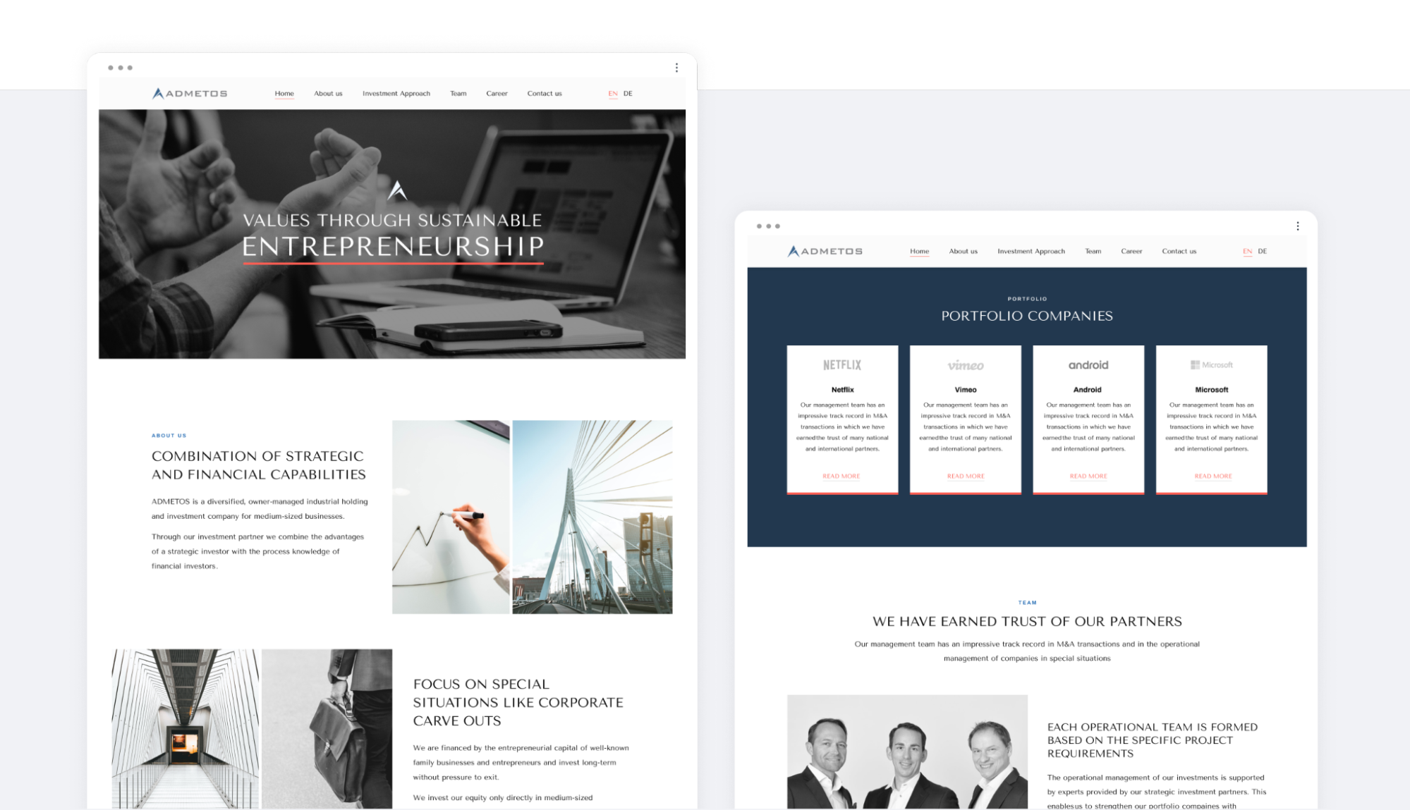
The main elements of the UI - geometric lines, corners, subdued colors, were chosen to form an image of professionalism, solidity, and trust. Images were the main tool to convey the values of Admetos. The photos of the moving city, transport, European business architecture communicate a sense of Excellence, Growth, and Impact.
The Tenor Sans uppercase font was chosen for the headings. It is elegant, clean, and legible which helps bring a business-like feel to the website.
Development
For the development process, we decided to use WordPress for easier posts automation. The Elementor Page Builder was installed to ensure one of the main goals - simple content editing by the Admetos team.
We set up separate admin panels for different languages. That ensures websites in both languages stay safe and unaffected by plugin updates.
Challenges
Setting up the website in the second language was one of the challenges during the development process as the design had to be adjusted based on the text’s length in German.
Some of the carousels had to be manually customized as their content is different on different devices. For example, on mobile texts are shorter.
For the pop-up windows with the company employees, we had to rewrite the standard code of the Elementor plugin. Three customized fields were added to the pop-up windows - links to LinkedIn and email, and the employee’s role.
An interesting task was to add tags to the contact form that represent the purpose of contacting the company. To implement it, we had to work with DOM elements and customize radio buttons.
Adding and styling Attach file buttons also required working with DOM elements.
On the pages with different job offers, the title of the contact form is dynamic. The title of the contact form is pulled from the title of the page - Apply for {PAGE TITLE}. So when sending a request via the contact form, users see which position they are applying to.
Result
The result was a modern-looking website that clearly stands out from the competitors. Due to the fairly straightforward setup, the company can maintain the website and can easily post jobs and add new team members.
Team
Denis Parfenov — Project Manager.
Anastasia Zubanenko - Project Manager.
Katya Sirotkina — UX/UI Designer.
Maria Chepurko - WordPress Developer.
inCode Ltd.
London, United Kingdom
Palliser Road, London, England, W14 9EB
inCode Systems LLC.
Austin, TX, USA
Austin, TX 78731