Design Principles: Creating Harmony in Interface
Discover the key principles of design harmony to enhance user experience and create visually appealing interfaces for successful web and app projects.
Imagine this scenario: a contractor-designer sends you layouts, you open them, and... something feels off. All the information seems to be there, and the colors are right, the logo is in place, but something just doesn't click. You tell them you "don't like it," and they refer back to the project brief, your requirements. You say, "You're the expert, not me," and they reply, "Give me specific feedback." But how do you provide feedback if it just doesn't "feel right"? If you lack experience in evaluating design, the situation can become quite frustrating. Sound familiar?
Therefore, we want to share some universal fundamental design principles with you.
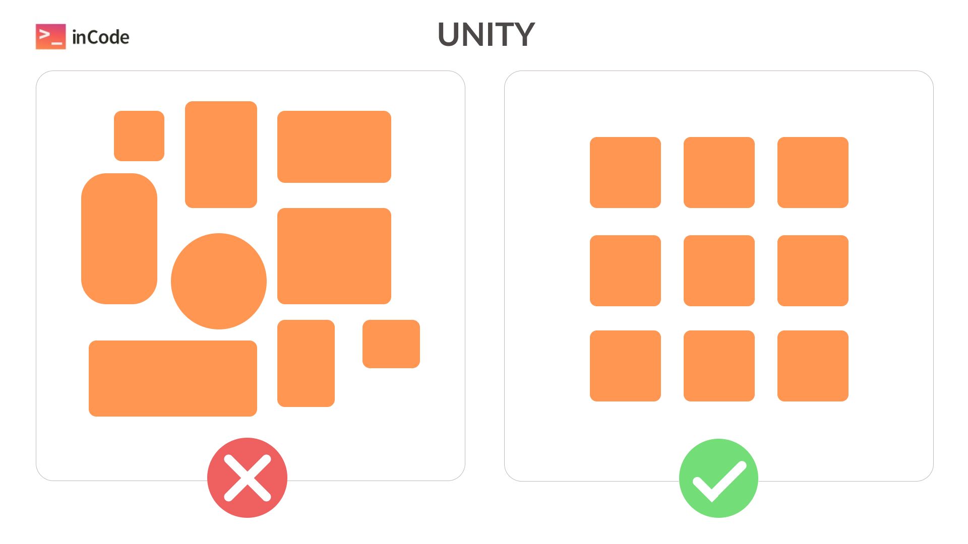
Unity
In the early days of the internet, websites used various styles, different element sizes, fonts, and the overall layout was disorganized. Focusing on anything specific was difficult. Gradually, the online world embraced harmony and realized it's better not to shout about everything but to maintain order.
👉 Does the design follow a unified style and color scheme, creating a harmonious overall look?
👉 Is the chosen font and typography consistent across the entire website/application?
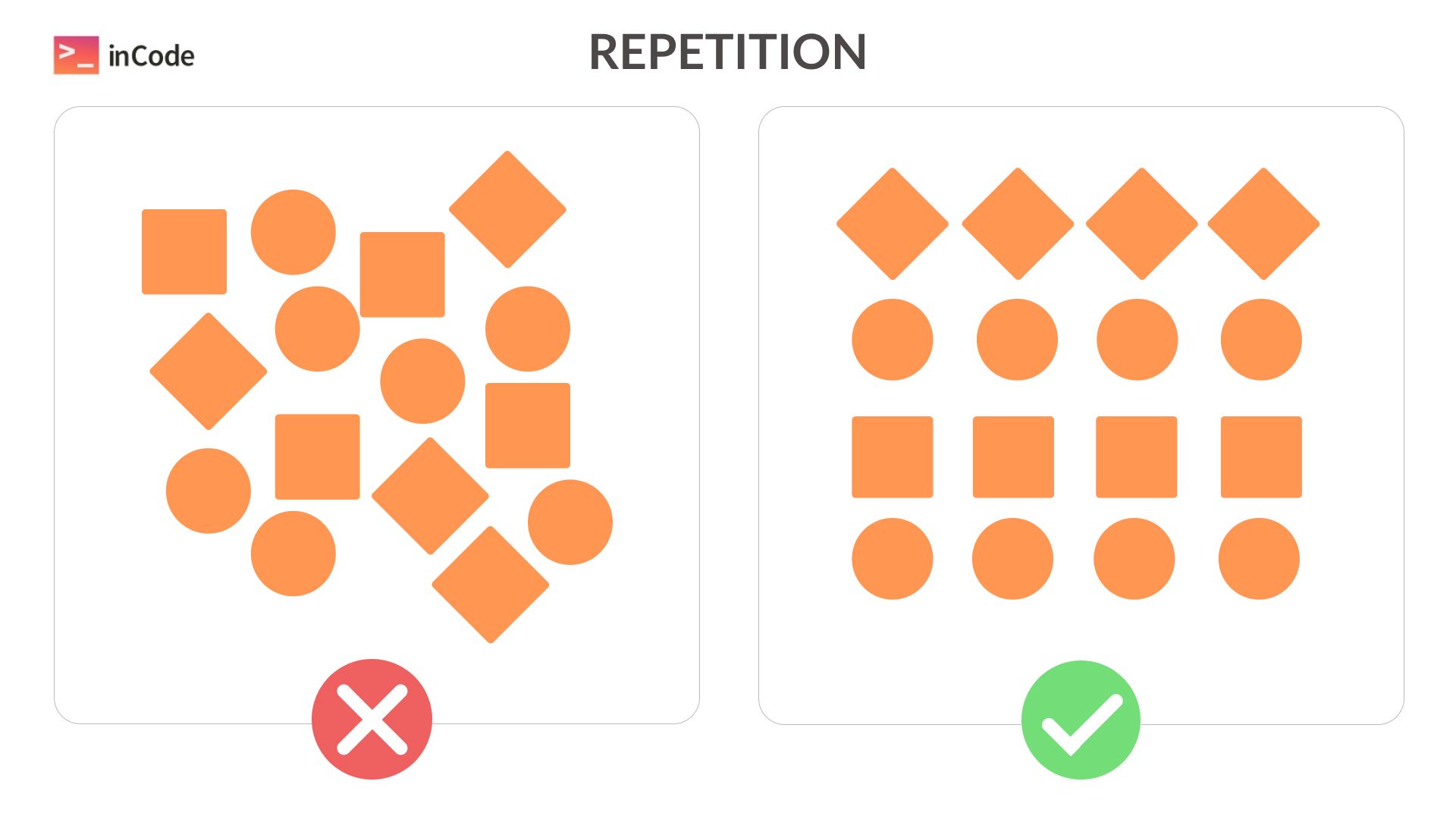
Repetition
Our brains seek patterns in everything. Consistency creates recognition and forms specific expectations about the content.
👉 Can you identify repeating elements or motifs in different parts of the interface?
👉 Is there consistency in the arrangement of elements on various pages or screens?
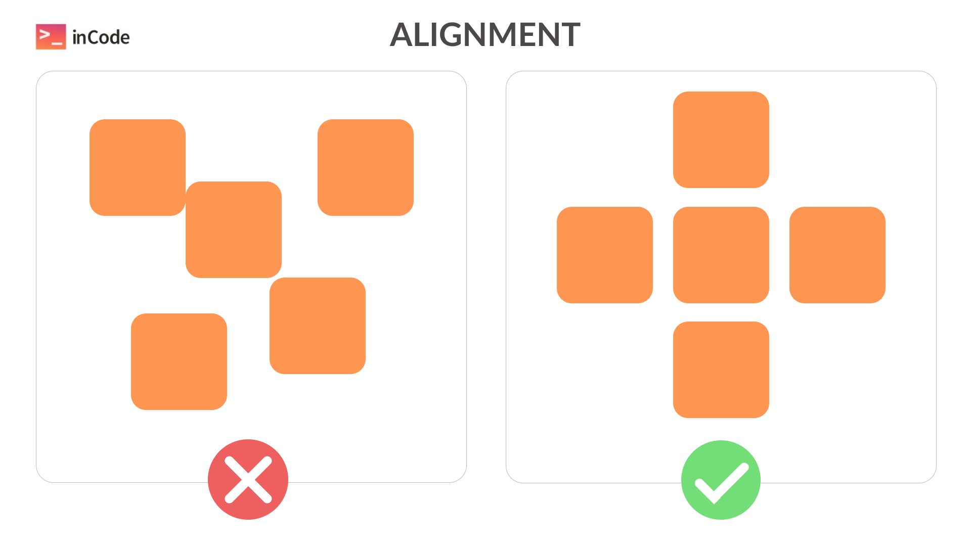
Alignment
The eye craves order. A web product should have a clear grid that guides the gaze. There's alignment on the edge (left/right or top/bottom) and center. Using too many alignment variations can make the design look chaotic.
👉 Is there a clear and visible grid for aligning elements on the page?
👉 Is there clarity and precision in the spacing of blocks from the edge of the page and/or other elements?
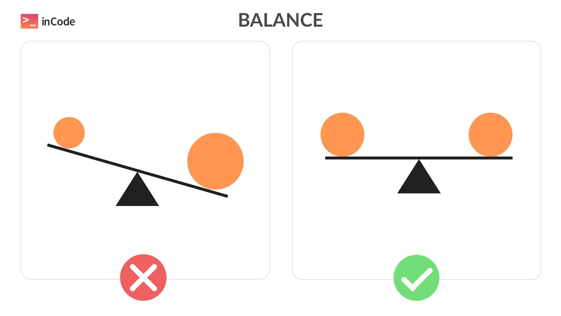
Balance
Bigger and darker elements carry more visual weight. Following symmetry gives a sense of equal weight, while asymmetry makes "heavier" elements appear more significant.
👉 Is there a balance between larger and smaller elements, creating visual equilibrium?
👉 Is symmetry or asymmetry applied? What sensations do the elements' weights convey?
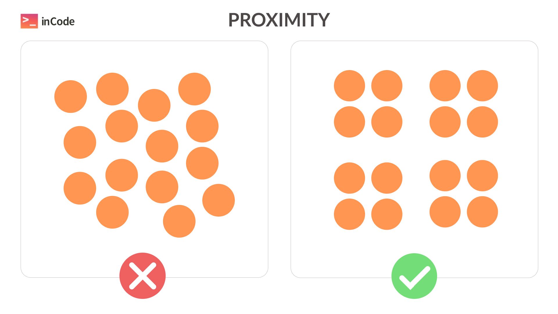
Proximity
Our brain perceives elements closer to each other as similar. It's an excellent way to group similar data and separate what the user should perceive separately from the rest.
👉 Can you identify data grouping based on the proximity of elements to each other?
👉 Are important elements distinguished from general information through distances between blocks?
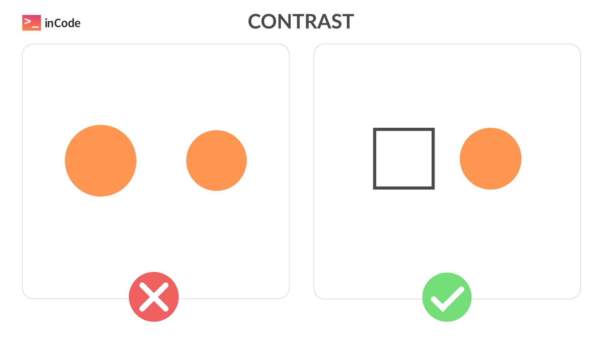
Contrast
If you need to emphasize a difference in functionality or significance, use contrast. Similar elements are perceived as alike. However, the entire product shouldn't have too many differing elements; otherwise, the eye tires. If everything demands attention, nothing stands out.
👉 Is contrast used intelligently, highlighting essential differences without excess?
👉 Does the overall color harmony persist when using contrasting elements?
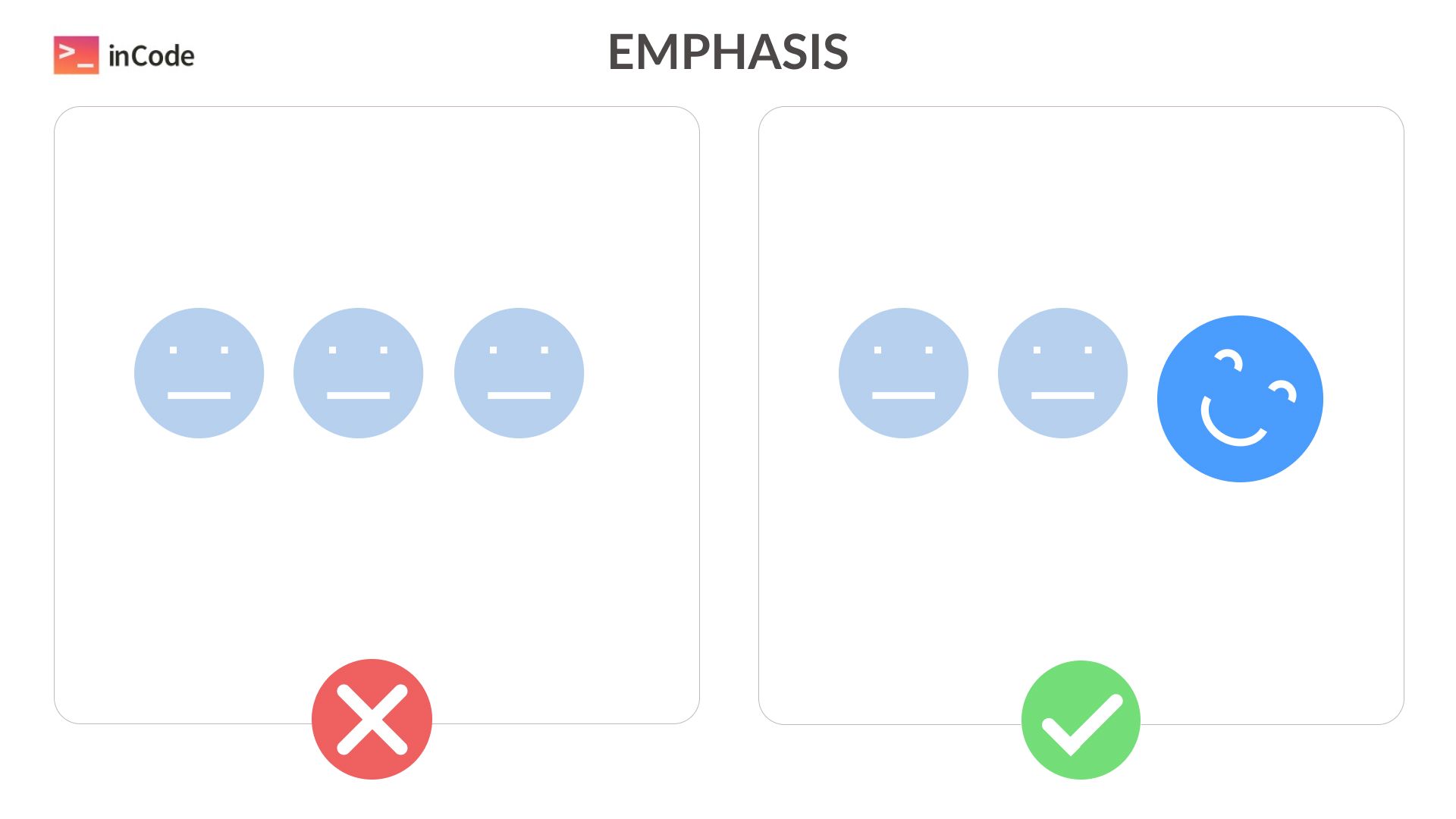
Emphasis
Don't confuse this with contrast. Here, the most crucial element from a similar set is emphasized but doesn't become entirely different.
👉 Are the most important elements highlighted without complete separation from the rest of the design?
👉 Are key elements emphasized, maintaining their visual connection with the overall style?
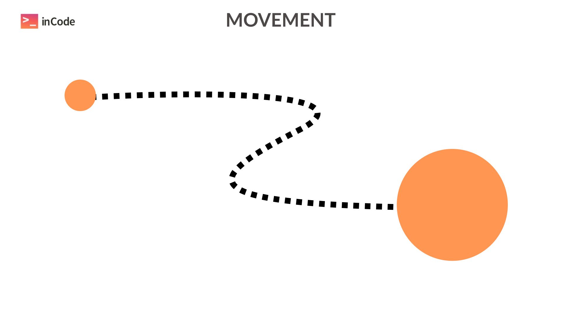
Movement
If the user needs to follow a specific path on the page, emphasize it visually.
👉 Is a specific user path highlighted through visual elements indicating direction (numbers, arrows, lines)?
👉 Does the user's path remain uninterrupted? Is there anything hindering it?
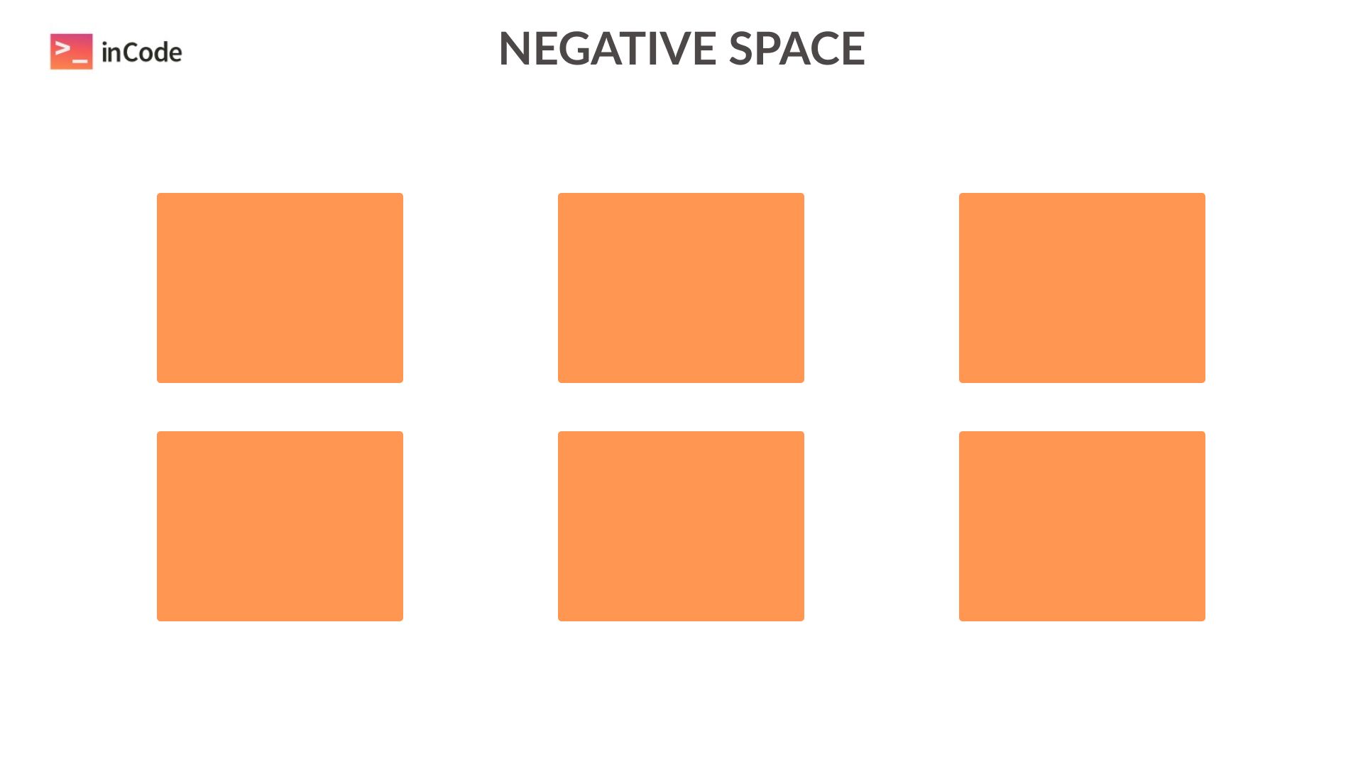
Use of White Space
Design needs "breathing room," and it should be utilized wisely. If elements overlap, they become less readable.
👉 Is there enough white space? Is the content easily readable and clear?
👉 Is there an optimal balance between filled and empty areas on the page?
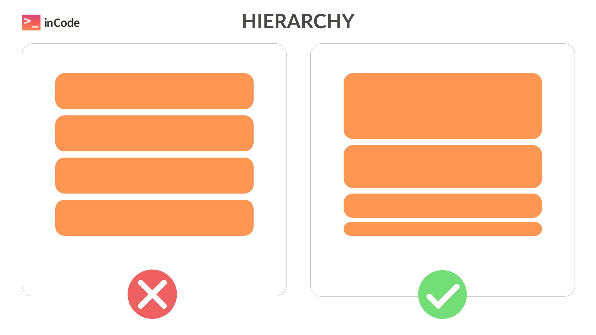
Hierarchy
Similar to how Word has different header levels, design follows suit. The hierarchy of elements can be emphasized through text size, boldness, or color saturation.
👉 Is there a visual hierarchy of elements (using text size, boldness, and color)?
👉 Is the hierarchy clear and understandable?
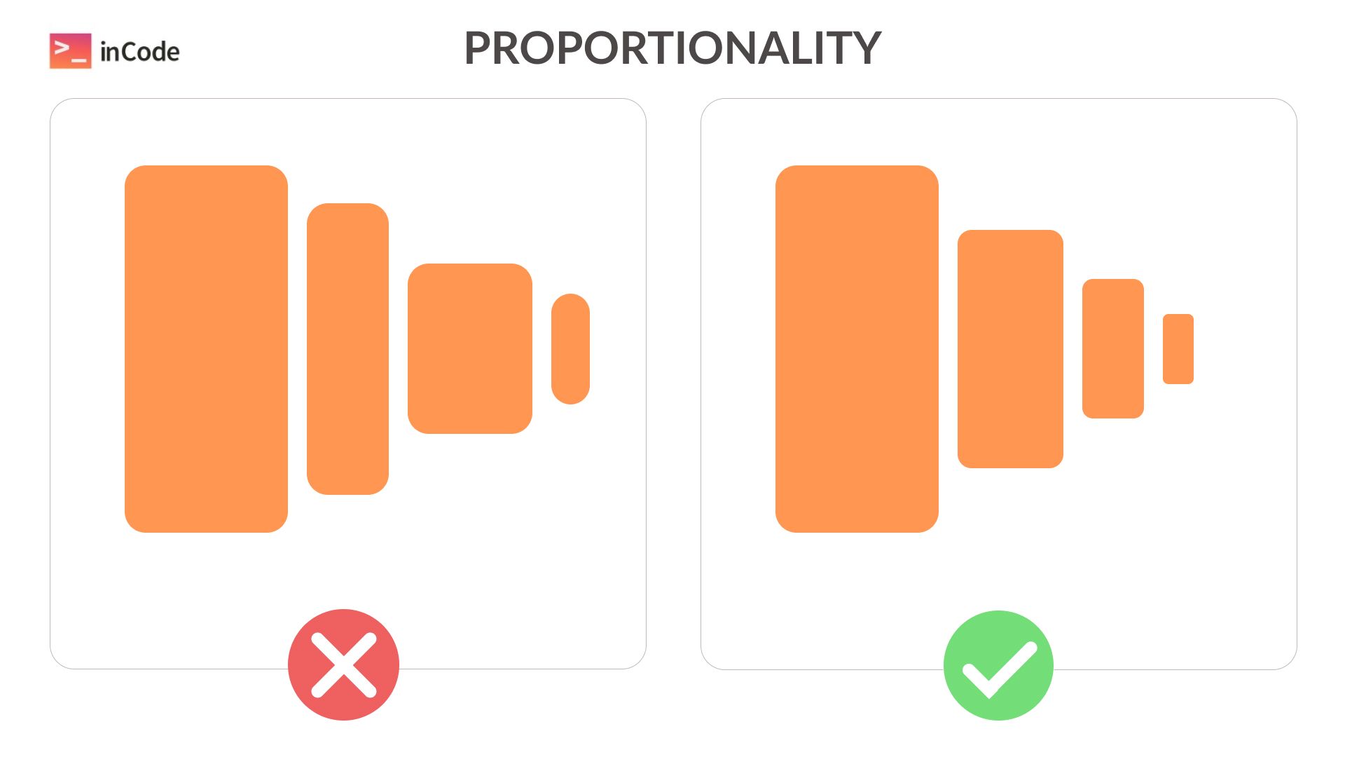
Proportionality
Proportions should remain balanced. Too obvious a difference disrupts harmony.
👉 Are proportions balanced among elements? Are there any imbalances?
👉 Do elements look natural in relation to each other considering their sizes and proportions?
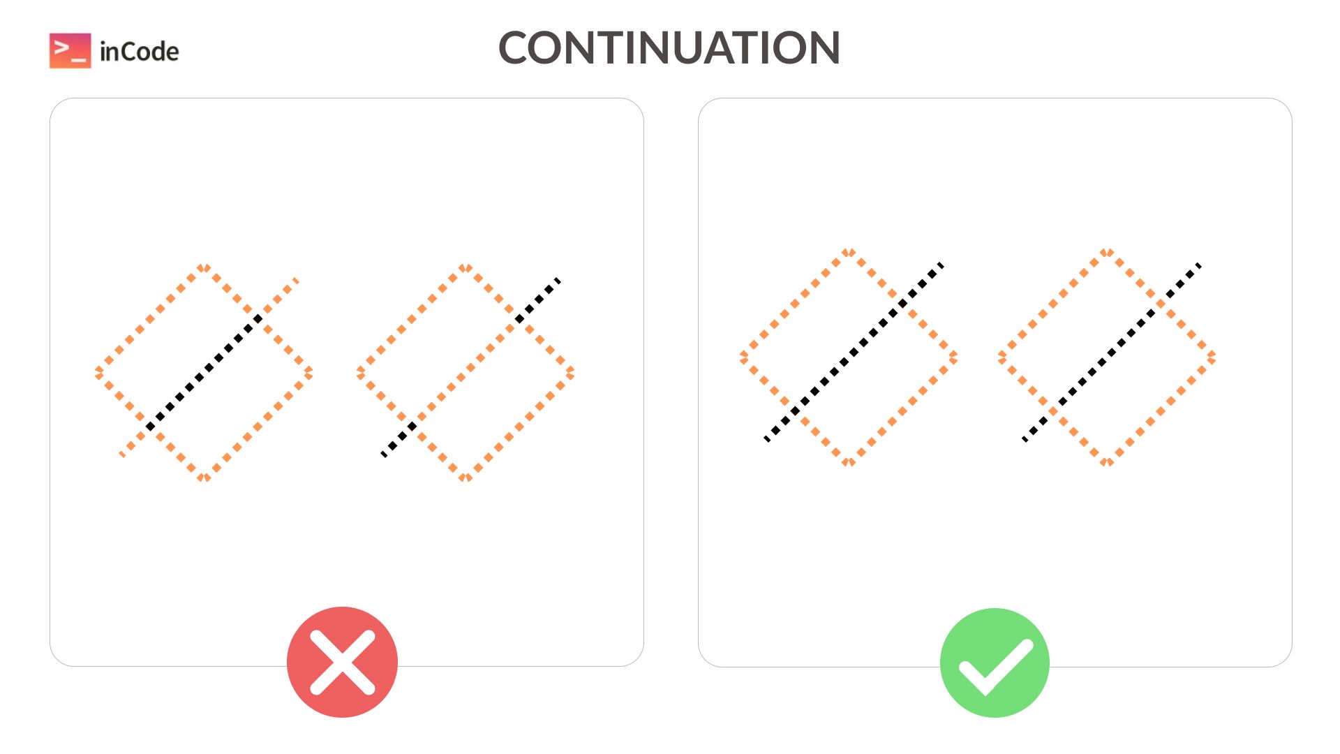
Continuation
The brain follows elements along lines, even at a distance. We recognize shapes and forms even if they're not entirely reflected. Don't disrupt the natural flow of such blocks.
👉 Is the natural representation of elements affected by their arrangement or shape?
This article utilized information from the uxcel website.
We hope these principles help you evaluate designs and create awesome products!
👉 We’re in the Top 50 UK designers agency list according to DesignRush.
inCode Ltd.
London, United Kingdom
Palliser Road, London, England, W14 9EB
inCode Systems LLC.
Austin, TX, USA
Austin, TX 78731